5 Hidden Showit Features That Will Transform Your Website Design (Most Users Don’t Know About #5!)

Published by

Are you getting the most out of your Showit website? These game-changing features will save you hours and make your design process infinitely smoother.
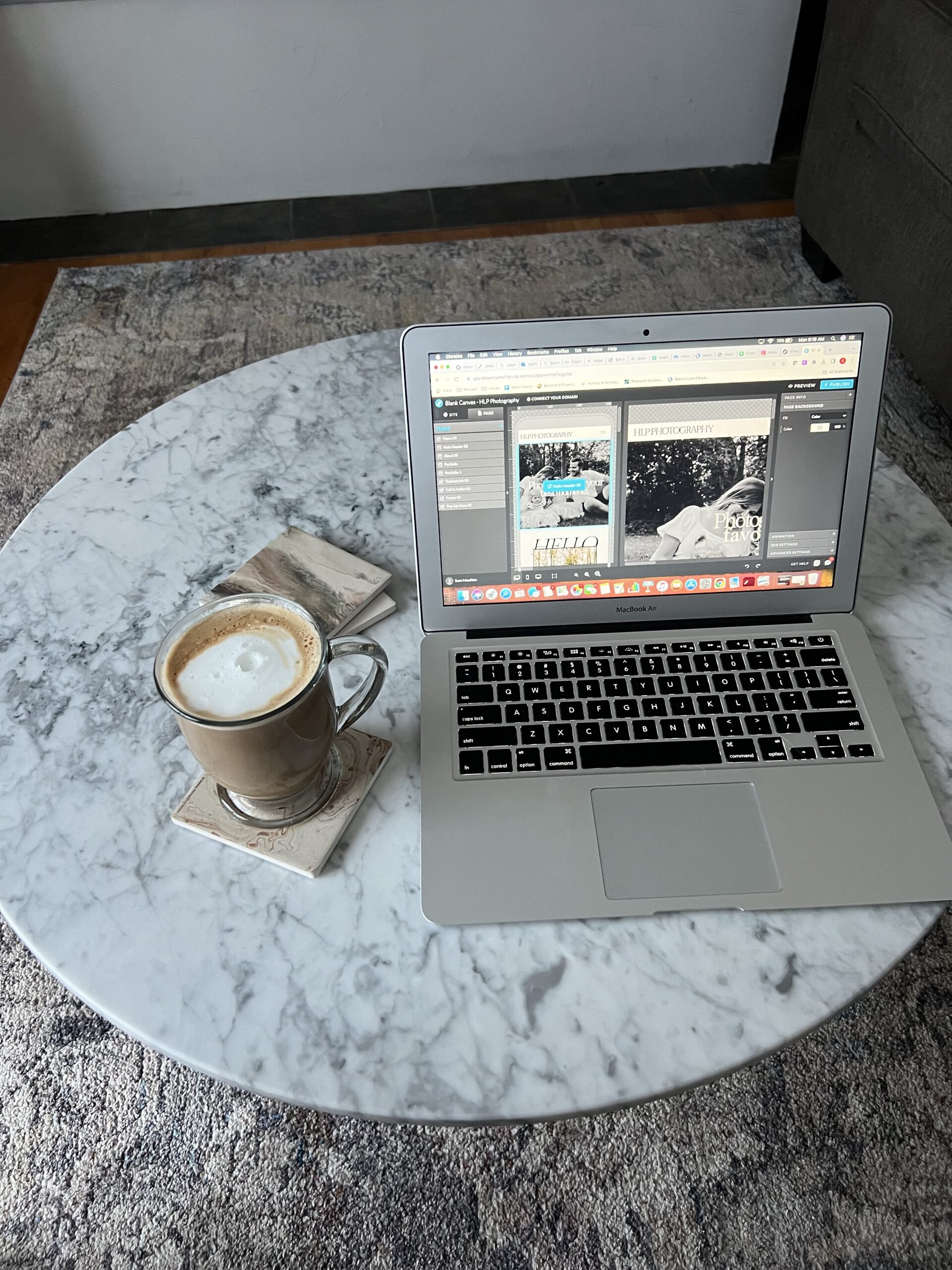
If you’re using Showit to build your website, you’re already ahead of the curve. But did you know there are powerful features hiding in plain sight that most users completely overlook? After spending countless hours designing Showit templates, I’ve discovered these 5 hidden gems that will revolutionize how you approach web design.
Why These Showit Features Matter for Your Business
Before we dive into the features, let’s talk about why knowing these tricks is crucial for your success. Time is money when you’re building your online presence, and these features can cut your design time by 75% while creating a more professional, polished website that converts visitors into customers.
Whether you’re a complete beginner or you’ve been using Showit for months, these features will transform your workflow and help you create the stunning website your business deserves.
Feature #1: Global Styles – The Ultimate Time-Saver

What it does: Change your font or color palette across your ENTIRE site with one click
Why it’s a game-changer: No more hunting through 47 pages to update your brand colors
This is hands down the most underutilized feature in Showit, and once you start using Global Styles, you’ll wonder how you ever lived without it. Instead of manually updating every single text element when you want to change your brand colors or fonts, Global Styles lets you make site-wide changes instantly.
How to use it:
- Set up your brand colors and fonts as Global Styles from the beginning
- When you need to rebrand or make adjustments, simply update the Global Style
- Watch as every element using that style updates automatically across your entire website
Feature #2: Smart Guides – Your OCD’s Best Friend

What it does: Those purple lines that help you align elements perfectly
Why it’s essential: Your OCD will thank you (and so will your website visitors)
Nothing screams “amateur” quite like misaligned elements on a website. Smart Guides are Showit’s way of helping you create pixel-perfect designs that look professional and polished.
How they help:
- Automatically appear when elements are aligned
- Help you maintain consistent spacing
- Ensure your design looks intentional and professional
- Work across different screen sizes for responsive design
Feature #3: Copy & Paste Styling – The Consistency Hack
What it does: Copy formatting from one text box (Command+C) and paste it to another instantly (Shift+Command+V)
Why it’s brilliant: Great time-saving hack for maintaining design consistency
This feature is perfect for maintaining visual consistency across your website without having to manually adjust font sizes, colors, hover settings etc. every time.
Best practices:
- Use it to quickly apply heading styles across different pages
- Perfect for maintaining consistent button styling
- Ideal for creating uniform call-to-action elements
Feature #4: Split Desktop & Mobile Design Settings

What it does: Allows you to edit one without changing the other
Why it matters: Super helpful when your desktop & mobile designs are different
This feature is crucial for creating truly responsive designs that look amazing on every device. Many users don’t realize they can have completely different layouts for desktop and mobile views.
When to use it:
- When you need different navigation styles for mobile
- For creating mobile-specific layouts that work better on small screens
- When desktop and mobile versions require different content arrangements
Feature #5: Element Locking – The Game Changer

What it does: Lock elements to prevent accidental movement while you work on other parts of your design
Why it’s revolutionary: No more accidentally dragging elements out of place
This is the feature that the Instagram post called a “game changer,” and for good reason. Element Locking prevents those frustrating moments when you accidentally move something you’ve already positioned perfectly.
Perfect for:
- Protecting your header and footer while designing page content
- Keeping background elements in place
- Maintaining your layout integrity during complex design work
Ready to Master Showit? Here’s How to Get Started
Now that you know about these hidden features, you’re probably excited to implement them in your own Showit website. But if you’re feeling overwhelmed about where to start or want to fast-track your success, I’ve got you covered.
Get a Head Start with Professional Showit Website Templates
Why start from scratch when you can begin with a professionally designed template that already incorporates all these features? Browse my collection of Showit website templates designed specifically for creative entrepreneurs who want stunning websites without the design learning curve.
Each template includes:
- Pre-configured Global Styles for easy customization
- Mobile-responsive design with split settings
- Professional layouts that convert visitors to customers
- Step-by-step customization guidance
Try Showit for FREE
Ready to dive into Showit but not sure if it’s right for you? Use my exclusive code to get one free month of Showit and test these features yourself without any commitment.
Learn with Step-by-Step Video Tutorials
Want to see these all the Showit features in action? Check out my YouTube video tutorials where I walk you through how to edit a Showit website in real time.
Your Next Steps to Showit Success
These 5 hidden features are just the beginning of what’s possible with Showit. The platform is incredibly powerful when you know how to use it effectively, and mastering these features will set you apart from the competition.
Remember:
- Start with Global Styles to save time on future updates
- Use Smart Guides for professional-looking alignment
- Copy and paste styling for consistency
- Take advantage of split desktop/mobile settings
- Lock your elements to prevent accidents
Whether you’re building your first website or your fiftieth, these features will streamline your workflow and help you create more professional results in less time.
Want more Showit tips and tricks? Follow @warmsoulgallery for weekly design inspiration and tutorials that will take your website to the next level.
Ready to transform your online presence? Explore our complete collection of Showit website templates and start building the website your business deserves today.

Recently Posted