Choosing the right color palette for your website is one of the most critical branding decisions you’ll make as a business owner. Whether you’re a marketing agency, social media manager, coach, course creator, real estate agent, or interior designer, your website colors communicate your brand personality before a single word is read.
We’ve curated five sophisticated warm color palettes that elevate your online presence and connect with your ideal clients. These website color schemes work beautifully across your Showit website template.
Why Warm Color Palettes Work for Service-Based Businesses
Warm colors create an inviting, trustworthy atmosphere that encourages potential clients to explore your services. Psychology studies show that warm tones evoke feelings of comfort, creativity, and approachability—exactly what you want when someone lands on your website.
For coaches and course creators, warm palettes build the emotional connection needed for conversion. Marketing agencies and social media managers benefit from sophisticated warm tones that feel both professional and creative. Real estate agents and interior designers can showcase properties and designs with colors that feel like home.
Palette 1: Luxe Burgundy Elegance
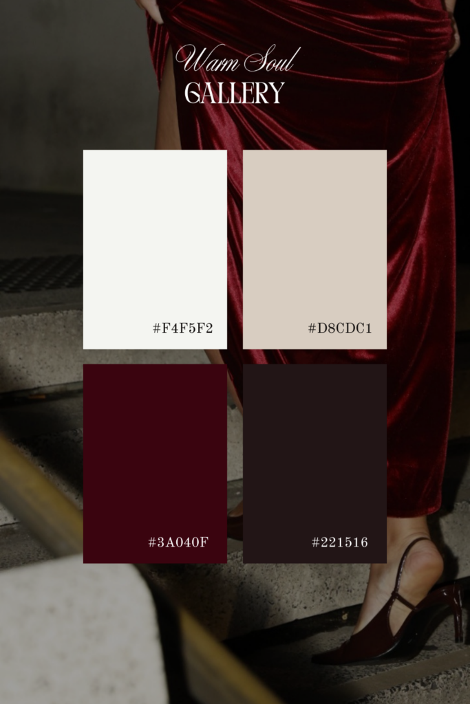
Colors: Deep Burgundy (#3A040F) • Rich Maroon (#221516) • Warm Cream (#F4F5F2) • Soft Beige (#D8CDC1)
This luxurious color palette is perfect for high-end service providers who want to convey sophistication and exclusivity. The deep burgundy creates a bold, memorable first impression while the neutral creams keep your website readable and elegant.
Best for: Luxury brand consultants, high-ticket coaches, premium marketing agencies, boutique real estate agents, upscale interior designers
Website template style: Use burgundy as your primary accent color for buttons and headers, with cream backgrounds and beige for secondary sections. This palette works beautifully with serif fonts and elegant photography.
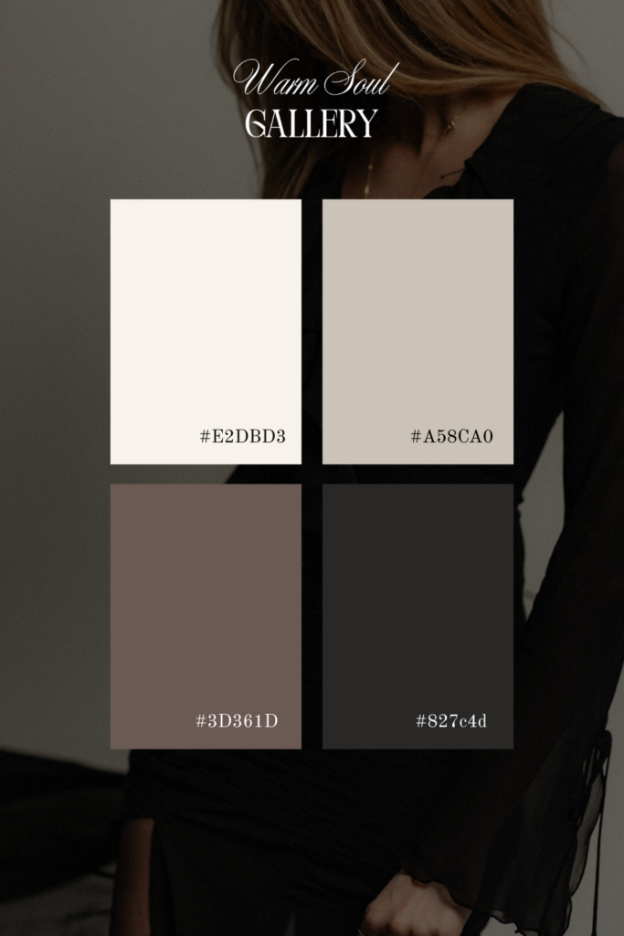
Palette 2: Organic Wellness Warmth
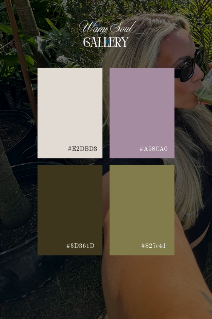
Colors: Earthy Olive (#3D361D) • Golden Khaki (#827c4d) • Soft Mauve (#A58CA0) • Warm Cream (#E2DBD3)
Natural, grounded, and calming—this earthy color scheme speaks to wellness-focused entrepreneurs and holistic service providers. The muted tones create a peaceful browsing experience that keeps visitors engaged.
Best for: Life coaches, wellness consultants, yoga instructors, health coaches, holistic marketing agencies, natural product creators, sustainable brand strategists
Website design tips: This palette shines in website templates with organic shapes, plenty of white space, and nature-inspired imagery. Use olive for navigation elements and mauve for subtle call-to-action buttons.
Palette 3: Coastal Professional
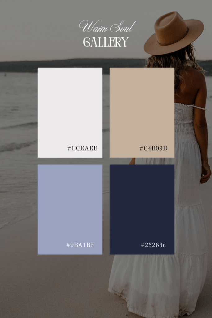
Colors: Navy Blue (#23263d) • Warm Tan (#C4B09D) • Soft Lavender (#9BA1BF) • Crisp Cream (#ECEAEB)
This timeless color combination balances professionalism with warmth, making it ideal for established businesses that want to feel both trustworthy and approachable. Navy blue anchors your brand while warm neutrals keep it inviting.
Best for: Real estate professionals, corporate coaches, established marketing agencies, professional service providers, business consultants, financial coaches, career coaches
Branding applications: Use navy for headers and footers, tan for section backgrounds, and lavender as an accent color for links and buttons. This palette works exceptionally well with modern sans-serif fonts and professional photography.
Palette 4: Minimalist Neutral Sophistication
Colors: Rich Taupe (#3D361D) • Warm Olive Gray (#827c4d) • Desert Sand (#A58CA0) • Soft Cream (#E2DBD3)
Clean, modern, and effortlessly chic—this neutral palette is perfect for creatives who want their work to take center stage. The warm undertones prevent your website from feeling cold or sterile.
Best for: Interior designers, photographers, creative agencies, brand designers, social media managers, content creators, online course platforms, portfolio websites
Website template recommendations: This palette is stunning in grid-based layouts and minimalist Showit website templates. Let your imagery be the hero while these sophisticated neutrals provide the perfect backdrop.
Palette 5: Warm Terracotta Creativity
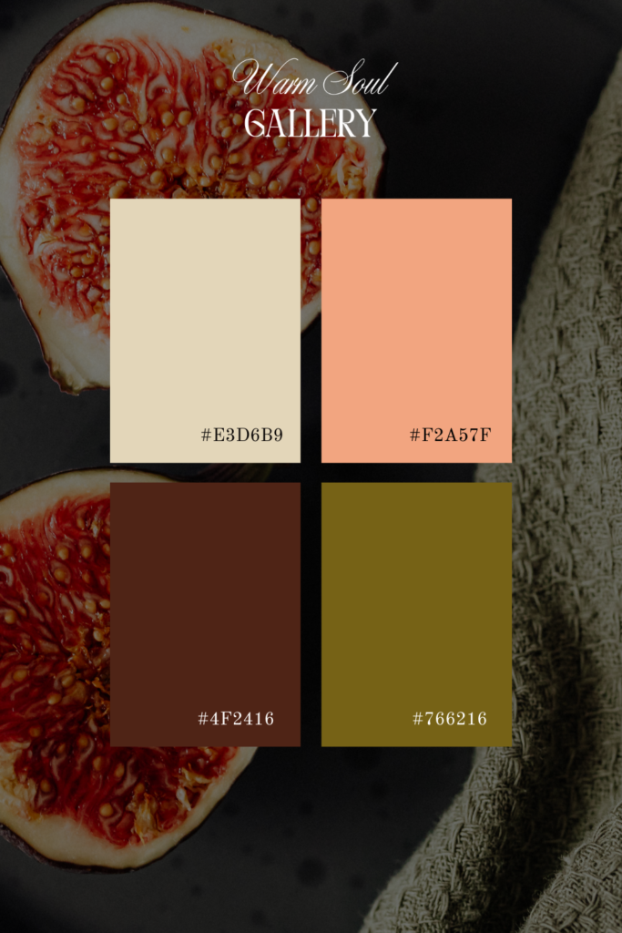
Colors: Terracotta Rust (#4F2416) • Coral Peach (#F2A57F) • Golden Amber (#766216) • Soft Cream (#E3D6B9)
Bold, creative, and energizing—this warm color scheme is perfect for entrepreneurs who aren’t afraid to stand out. The terracotta and coral tones feel current and fresh while maintaining a professional edge.
Best for: Creative coaches, course creators, social media managers, marketing agencies for creative industries, artists, handmade business owners, brand photographers, event planners
Design strategy: Use terracotta as your primary brand color, coral for buttons and calls-to-action, amber for accents, and cream for backgrounds. This palette pairs beautifully with bold typography and dynamic layouts.
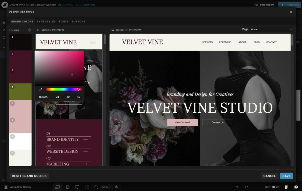
How to Implement These Color Palettes in Your Showit Website Template
Showit’s design flexibility makes it easy to customize any template with these color palettes. Simply update your color swatches in the design panel and apply them throughout your site. Remember to maintain consistency across all pages for a cohesive brand experience.
Color Psychology for Business Websites
Understanding color psychology helps you choose the right palette for your specific business goals:
Burgundy and deep reds convey luxury, passion, and confidence—perfect for premium service providers.
Earthy tones communicate authenticity, reliability, and groundedness—ideal for coaches and wellness professionals.
Navy blue represents trust, stability, and professionalism—essential for established businesses and financial services.
Neutrals suggest sophistication, elegance, and timelessness—perfect for creatives and designers.
Terracotta and coral express creativity, warmth, and approachability—great for course creators and social media managers.
Matching Your Color Palette to Your Brand Strategy
Your website color palette should align with your overall brand strategy and target audience. Ask yourself:
- What emotions do I want potential clients to feel when they visit my website?
- What does my ideal client value most—luxury, authenticity, professionalism, creativity?
- How do I want to differentiate from competitors in my industry?
- Does this palette work with my existing brand photography and graphics?
Additional Design Elements to Consider
A beautiful color palette is just the beginning. To create a cohesive, professional website that converts visitors into clients, also consider:
Typography: Pair your warm color palette with fonts that match your brand personality. Serif fonts convey elegance and tradition, while sans-serif fonts feel modern and clean.
Photography style: Ensure your images complement your color scheme. Warm-toned photography works beautifully with these palettes.
White space: Don’t be afraid of breathing room. Strategic white space makes your content more digestible and your design more sophisticated.
Consistency: Use your colors consistently across all pages, from your homepage to your about page to your service pages.
Ready to Transform Your Website?
The right color palette can transform your online presence from forgettable to unforgettable. Whether you’re launching a new website, rebranding your business, or refreshing your current design, these warm, sophisticated color schemes provide the perfect foundation.
Browse our collection of website templates and discover designs that already incorporate these beautiful color palettes. Each template is fully customizable, mobile-responsive, and designed to help you attract your ideal clients.
Your dream website is just a color palette away.
Recently Posted